
SNAP INTO THIS ILLUSTRATION, OOH YEAH!
There are some people in this world that just scream “draw me.” And then there’s Macho Man Randy Savage—who leapsoff the turnbuckle and demands it.
I recently had the absolute pleasure of illustrating the Madness himself in a commissioned piece, and you better believe I went all in. I chose his early pink-and-yellow gear (because peak ‘80s wrestling should look like a highlighter exploded), and I captured him mid-flight, elbow cocked, coming right for ya. If you ever had the joy of watching Macho Man sail through the air with all the grace of a sequined missile, then you know exactly why I had to draw him this way.

A Little Madness Goes a Long Way
Randy Savage wasn’t just a wrestler. He was a force of nature. The voice? Gravelly perfection. The promos? Unhinged genius. The in-ring ability? Unreal. He could go from top-rope acrobat to technical wizard in the blink of an eye, making every match feel like the main event.
But here’s a fact that might surprise you—before he was snapping into Slim Jims, Savage was swinging for the fences. Yep, Macho Man played professional baseball! Signed by the St. Louis Cardinals right out of high school, he spent a few years in the minors as a catcher. When an injury took him out of the game, he did what any reasonable person would do—reinvented himself as one of the most electrifying wrestlers of all time.
A Flying Tribute
This illustration is my love letter to one of wrestling’s greatest performers—a guy who made everything larger than life, from his wardrobe to his elbow drop to the way he said, “DIG IT!” And if you have a favorite athlete, musician, or pop culture legend you’d love to see immortalized in art, you know where to find me.
OHHH YEAH!
The Babe with the Power
Inspired by the cult classic, Jim Henson monster-filled 80's movie, Labyrinth, this design is available at my TeePublic shop on apparel and other ostentatious articles of amazingness.

George Newman, Director of Channel U-62
The painting sold on opening night of the show and as a ridiculously fun and mind-blowingly cool bonus, Al retweeted the painting as well as reposting the picture on his own Instagram! I had to take a moment to breathe...
So here is George Newman, Director of Channel U-62:

A comic that basically recounts my childhood in one sitting
That being said, here is my pretty true to life comic. I was a Nintendo junkie.


A little update
In the meantime, I will try to update some more work here!
I was asked to speak at my old school, Calvary Chapel Bible College, by a good friend and former student. He wanted me to share about life, faith and Art and how those things mingle in the post-social media mayhem-ish world we live in. He teaches an Apologetics class at the school so the students were sharp. Probably much sharper than myself. Nonetheless, it was a really encouraging night and I think it was really fruitful.
In the weeks prior to speaking I was feeling pretty unsure of myself in respect to sharing. The old, "Oh, what do you have to share anyway?" monster kept popping up. It got me thinking some deep thoughts. Now cue Jack Handey.
Anyway, I was thinking a lot about how my struggle to walk in a way that's in line with my faith in Christ and according to God's word is 1. super irritating (I know what I believe but so often fail to live it out) and then 2. most certainly an opportunity for God to show His goodness.
So, although pretty frustrating, the struggle becomes one of the most potent bases for artwork. My sketchbook becomes a place where I can work out questions I'm having or play with ideas I find in scripture. Sometimes, these become finished drawings or paintings, sometimes they just stay rough pencils.
 |
| From James 1:5-8 |
Mr. E pity the fool that doesn't eat their vegetables

He's part of a little something I've been working on that's in the final stages. Updates soon(ish)!
Bookmarks!
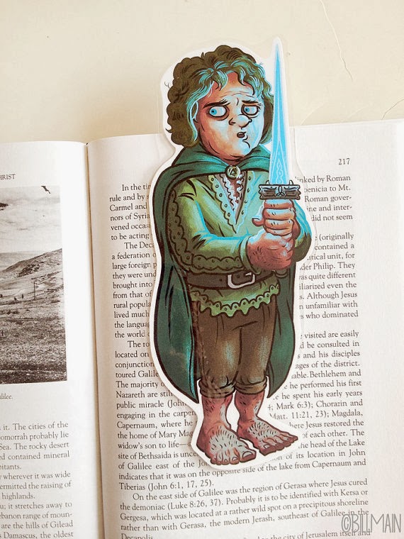
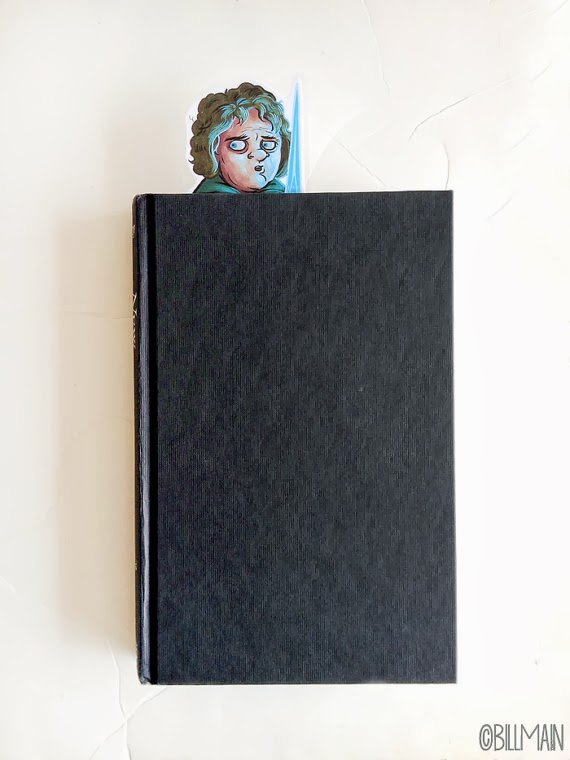
For one of my bookmarks, I decided to make a Bilbo Baggins because I just love that sweet little hobbit. Everything about him. Everywhere he goes, he just wants to go and eat. He just wants to eat breakfast. I can relate Bilbro.

He's got his Elfen blade, Sting, with him...glowing because there are always goblins around, of course.

If you would like a Bilbo for yourself, or a bookworm friend, you can find him here.

Fat Elvis bookmarks are a multi-tasker- they are perfect for cookbooks and rock n' roll biographies.

Then again I literally have this fat tub-o-lard bookmark sitting in my bible. I giggle every time I look at it.


Her Eyes Can Be So Cruel
This piece up at the Say Hi To the Bad Guy show at Gallery 1988 West. The show is covering the love of the bad guys in cult classic film. Opening night is Friday, October 18th, 7-10 PM
 |
| Her Eyes Can Be So Cruel Acrylic on panel 8.5" x11.25" x 3" |

Undertaker sketch

Some Etsy custom orders


Laser Cats at Gallery 1988


Double the Dragon, Double the Fun
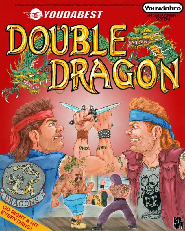
Abobo lives, brother!


Bullet in the Brain - Tobias Wolff
For the image, I set the scene in a bank. I cropped Anders’ head so it was more of a framing device. Because I chose to use the moment of action as the image, I felt like if the viewer’s eye was panned out too far to see the gun’s muzzle flash , Anders’ bodily reaction to the gunshot, and the masked robber it would be a little heavy handed. (At least the way I kept drawing it.) For color, I kept the "present" in monochrome, as I feel that Anders had lost his zest for the life he was living. It is telling of his nature that he doesn’t think of classic, pivotal moments that one might remember in their last moments. Anders keeps this interaction with his childhood peers deep in his psyche. He feels the heat, smells the air, and sees the yellow summer grass on the baseball field. So, instead of having this meaty, bloody spray shooting out of this gentleman’s head,(as I initially drew) I kept working until I saw something a bit more visually interesting and ethereal. I like the play between the figures in color and the cropped out figure in B&W. For myself, memories are often triggered by something I see right in front of me, so I wanted a little play between the “then” and the “now.”
I started with a simple line drawing with a wash. I used a #6 sable round just to get my major shapes in order without having to fuss later on.

From here, I just started dropping in tone and color. Its kind of an intuitive process when it comes to color choice. There are certain colors that don’t make natural sense to go a certain place but I’ll put them there just because I like how it reacts with the color next to it. I like this stage. Its like a patchwork at this point and I can decide what to leave out and what to push a little further. Now is when I reassess my initial thoughts on where I want to lead the eye, value and which colors to bring out more.

I add a little more focus on the “memory” part of the image and call it done. Last image is the final image.
