
Sketching Through Acts: Visual Notes from Sunday Mornings
Lately, at church, we’ve been going through the book of Acts—and every Sunday I pull out my SketchWallet during the sermon and start drawing. It’s not about zoning out or keeping my hands busy (though it does help with that); it’s a way for me to stay focused, to engage, and to let what I’m hearing sink in a little deeper.

Acts is packed. There’s so much momentum—miracles, bold preaching, persecution, people getting radically saved. The early church is just moving. It’s wild. And sitting there, listening, I can’t help but start visualizing things: Peter standing in front of a crowd, jail doors flying open, tongues of fire resting on people’s heads. There’s something raw and vivid about it all.

Drawing during the sermon helps me connect to the text in a way that’s natural for me. It’s kind of like journaling, but with a pencil and a cartoonist’s brain. Some days I sketch out scenes straight from the passage, other times it’s just expressions or small moments that stand out—a gesture, a symbol, a burst of light.

I don’t overthink it. I just draw and listen. And somehow, the Word sticks with me a little better.

If you’re wired like me—visual, doodle-prone, easily distracted—I highly recommend keeping something like a SketchWallet with you at church. Not as a crutch, but as a way to stay present. You might be surprised what comes out of your pencil when your heart’s tuned in.


Also, if you ever want to talk Acts (or art, or both), my inbox is open.
#BookOfActs #FaithAndArt #SketchWallet #ChurchNotes #ChristianArtist #VisualFaith #BibleStudy #SermonSketches #ActsOfTheApostles #SundayDrawings
New Brunt of It Album Art
Brunt of It is back with a brand new album, It’s a Mad, Bad, Sad, Rad World, and I had the absolute pleasure of designing the cover for Boofish and the gang. This one was a blast to work on—equal parts chaotic, satirical, and just plain fun, much like the music itself.

Tapping Into Brunt of It’s Signature Look
If you’re familiar with Brunt of It, you already know their go-to color palette: that punchy red, yellow, and black. It’s loud. It’s in-your-face. And it fits their sound like a knuckle sandwich. I leaned into that energy hard, making sure this cover felt right at home alongside their past work while pushing it into some new, wild territory.

SNAP INTO THIS ILLUSTRATION, OOH YEAH!
There are some people in this world that just scream “draw me.” And then there’s Macho Man Randy Savage—who leapsoff the turnbuckle and demands it.
I recently had the absolute pleasure of illustrating the Madness himself in a commissioned piece, and you better believe I went all in. I chose his early pink-and-yellow gear (because peak ‘80s wrestling should look like a highlighter exploded), and I captured him mid-flight, elbow cocked, coming right for ya. If you ever had the joy of watching Macho Man sail through the air with all the grace of a sequined missile, then you know exactly why I had to draw him this way.

A Little Madness Goes a Long Way
Randy Savage wasn’t just a wrestler. He was a force of nature. The voice? Gravelly perfection. The promos? Unhinged genius. The in-ring ability? Unreal. He could go from top-rope acrobat to technical wizard in the blink of an eye, making every match feel like the main event.
But here’s a fact that might surprise you—before he was snapping into Slim Jims, Savage was swinging for the fences. Yep, Macho Man played professional baseball! Signed by the St. Louis Cardinals right out of high school, he spent a few years in the minors as a catcher. When an injury took him out of the game, he did what any reasonable person would do—reinvented himself as one of the most electrifying wrestlers of all time.
A Flying Tribute
This illustration is my love letter to one of wrestling’s greatest performers—a guy who made everything larger than life, from his wardrobe to his elbow drop to the way he said, “DIG IT!” And if you have a favorite athlete, musician, or pop culture legend you’d love to see immortalized in art, you know where to find me.
OHHH YEAH!
Why My Design Portfolio Is Different From My Illustration Portfolio
If you’ve browsed through my site, you might’ve noticed something: my Illustration portfolio has a very distinct, consistent style, while the Design section is more of a mix. That’s not a coincidence—it’s intentional. Today, I want to talk about why I approach these two sections differently and why that matters for potential clients, art directors, and anyone curious about my work.

When art directors visit an illustrator's portfolio, they’re often looking for one thing: consistency. They want to know exactly what they’re getting when they hire an illustrator. That’s why my Illustration portfolio sticks to what I like to call my “hero style.” It’s the look and feel I’ve honed over the years—cartoonish, expressive, and full of personality. Keeping it focused makes it easy for someone to picture how my work could fit their project.
But the Design section? That’s where I get to flex my versatility. It’s like the backstage tour of my creative process. I’ve had the opportunity to work with so many different types of businesses—everything from food packaging to children’s education, to motion graphics for big brands—and each project has its own unique needs. Sometimes that means working in a sleek, minimal style; other times, it’s bold and colorful. The style shifts depending on the audience, the brand identity, and the story that needs to be told.

For me, design is about solving problems. It’s about understanding what the client or brand needs and delivering something that works for them. That might mean creating an illustrated logo, designing eye-catching packaging, or crafting a cohesive visual system for a product line. The Design section of my site is where I show that range—where I let the project dictate the style, rather than the other way around.
So if you’re an art director looking for someone with a consistent, dialed-in style, my Illustration portfolio is for you. But if you’re a business looking for a designer who can adapt to your specific needs, dive into the Design section. You’ll see how I approach each project with fresh eyes, tailoring my work to fit the brand, the audience, and the story it needs to tell.

Thanks for stopping by—and if you’ve got a project in mind, let’s chat! Whether you’re looking for that hero style or something a little more custom, I’d love to help bring your vision to life.
Rest in Peace Sid Eudy
One of the best big man wrestlers of the golden era has passed. Rest in peace Sid.


The Art of Bill Main: Wrestling Mania
Oh hi there!
Remember the 80’s, when larger-than-life characters dominated not just the big screen but also our living rooms through the magic of professional wrestling? I’ve always been fascinated by the drama, the spectacle, and the sheer artistry of it all. Recently, that fascination has turned into a bit of an obsession, and my Instagram profile (@itsbillmain) has been flooded with a crazy amount of wrestling drawings.

From classic legends like Hulk Hogan and Macho Man Randy Savage to modern icons like John Cena and Becky Lynch, I’ve been sketching, inking, and coloring my heart out. Each drawing captures a moment, a pose, or a signature move that defined these wrestling superstars. It’s been a blast, and the feedback from everybody has been incredible!
The Next Big Thing: The Art of Bill Main Book
With so much content piling up, I’ve started thinking about taking this passion project to the next level. What if I could compile all these wrestling artworks into one epic collection? Enter “The Art of Bill Main: Wrestling Mania” – a book dedicated to showcasing my wrestling drawings in all their glory.
So far I just have the idea and the vision. I’ll still need to knock it around a little to flesh it out.
The Licensing Adventure
Of course, creating such a book isn’t just about putting pen to paper. There’s a whole world of licensing to navigate, as these wrestlers are part of larger-than-life franchises with their respective companies. I’m currently exploring options to ensure that this project is legit and that every piece of art in the book is properly licensed.
It’s a bit like leveling up in an old-school RPG – there are quests to complete, bosses to face, and treasures to uncover. But I’m ready for the challenge because I believe this book could be something special.
Join the Journey
So, what’s next? Well, I’m diving headfirst into the licensing process, and I’ll be sharing updates along the way. Your support means the world to me, and I’d love for you to join this journey. Follow me on Instagram (@itsbillmain) for the latest drawings and behind-the-scenes looks at the making of “The Art of Bill Main: Wrestling Mania.”
And hey, if you have any tips or connections in the world of wrestling licenses, hit me up! Together, we can make this book a reality.
Stay tuned, stay creative, and let’s keep the wrestling mania alive!
Until next time, brother!


Super Over It Mario
Crammed a bunch of older game references in. Available at my shop on apparel and other super good goodies.
I feel like a middle-aged, Italian plumber wouldn't be all that excited to be fighting evil dragons and anthropomorphic mushrooms year after year...

The Babe with the Power
Inspired by the cult classic, Jim Henson monster-filled 80's movie, Labyrinth, this design is available at my TeePublic shop on apparel and other ostentatious articles of amazingness.

George Newman, Director of Channel U-62
The painting sold on opening night of the show and as a ridiculously fun and mind-blowingly cool bonus, Al retweeted the painting as well as reposting the picture on his own Instagram! I had to take a moment to breathe...
So here is George Newman, Director of Channel U-62:

About Bill Main
 My name is Bill Main and I make art.
SpongeBob Squarepants Storyboards

It's the gremlins I tell you. Internet Gremlins are the worst...they're all, "Hey! Don't be productive! Enjoy this rabbit hole of cat videos and Tweet holes!"
*Tweet Hole- That thing where one tweet brings you to the next until you find yourself reading things you've never been interested in.
Anywho...I went to CTNX a couple weekends ago and it was pretty amazing. I had been wanting to go for a while but didn't bite the bullet till this year. SO GLAD I DID. I was just going to go with a general visual development concept art portfolio and get some reviews done. However, I've been enrolled in a class called Oatley Academy Live at the Oatley Academy of Visual Storytelling and it's really changed (for the better) my work. I'll be making a post soon about my personal project that I've been developing through that class but on to the point of this post.
Through the class, I've been trying to develop my style of storytelling, my humor and a my one big goal has been to always create something with a definable Beginning, Middle and End while saying something that matters. Director of the Oatley Academy and all around Super Dude really encouraged me to make a set of storyboards for SpongeBob Squarepants to bring to CTN and I'm so glad I did. After asking Chris if I should use an existing script for SB or write my own jokes, Chris was all for me writing my own gags. So that's just what I did:


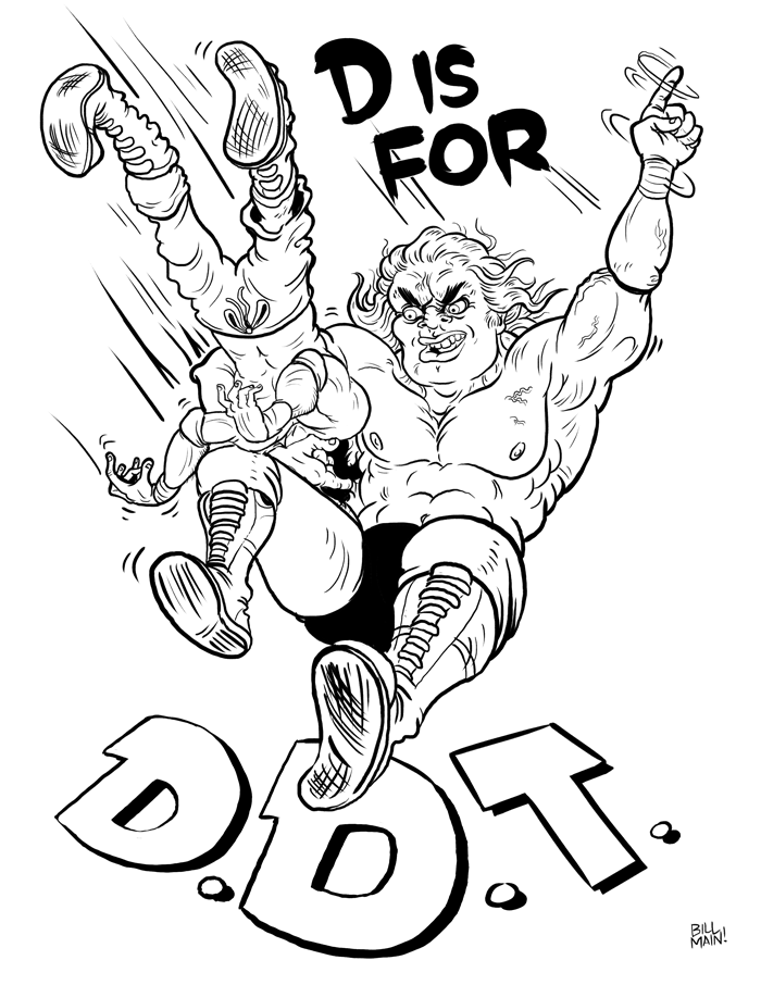
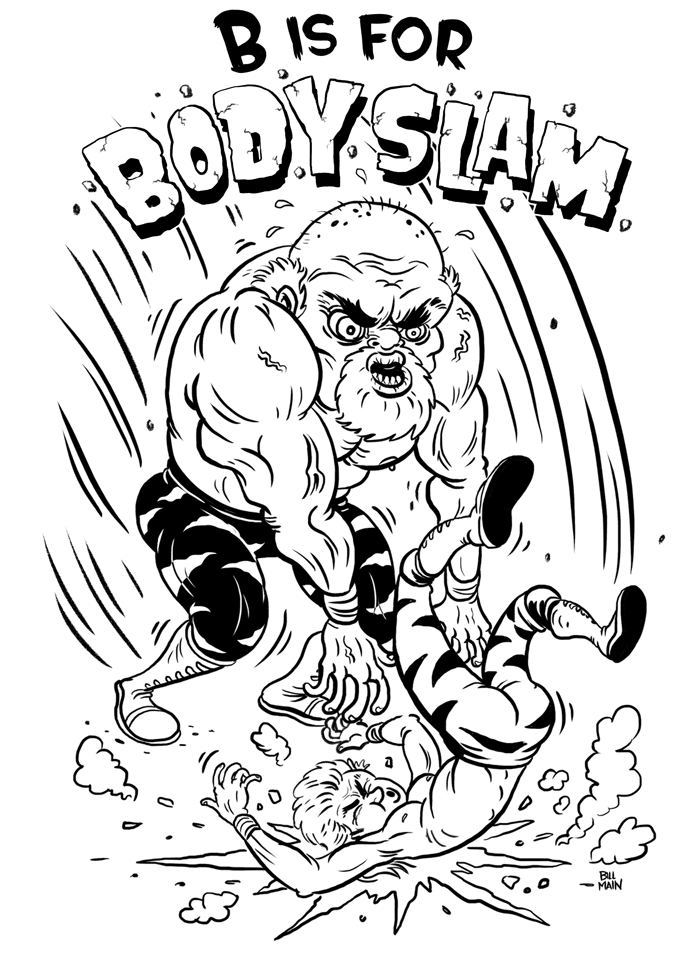
Catching up with the ABCs of Pro Wrestling...
Let's catch you up on the ABC's of Pro Wrestling


The ABC's of Pro Wrestling - B is for Bodyslam
It's Bill Main here with another installment of your favorite Rat Fink-y, weirdo, pro wrestling, t-shirty, ABC booky fantastic-ness!
Whew...that was a mouthful.
When thinking about what piece of wrestling terminology or move might best encapsulate the letter B, I wanted to go super classic. Even people with a passing knowledge of pro wrestling will be aware of the friggin' BODY SLAM! Say it with me now folks, "Baaaaaaahhhhhhdeeeeee Slllllllaaaaaaaaaammmmmmmm!"
Ahhhhhh. Thanks for indulging me in that. What are these illustrations gonna end up as? Definitely a book, hopefully some t-shirts. Got any other ideas for things you might like to see these bad boys and girls as? Let me know in the comment section!
Check out my illustration for the letter A here

One week webcomic - Lil' Squirt
Hey everybody! Here's a little shorty webcomic I recently made and published online through the
. I switched over to a style that was going to let me produce this puppy really quickly as we had just had our first baby (who is now 3 months old!!!!) and time was definitely of the essence. It still is, but by God's grace I've been able to stay on top of my other projects. Anywho, please enjoy Lil' Squirt. If you do like it, feel free to leave me feedback either here or Twitter! I love hearing from you guys. Thanks!

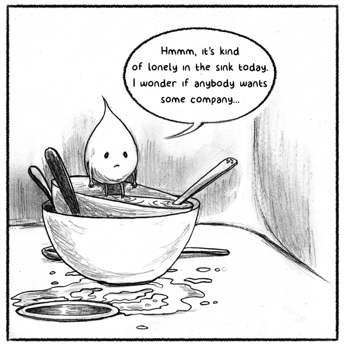


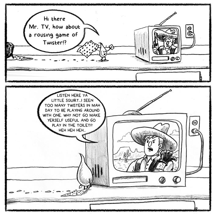


Well, well, well...Lil' Squirt saved the day! Sometimes, we aren't the ones who change much in our day to day living. However, when we treat others lovingly and with a little respect, we may just change how they act and react with others.
Go be awesome out there folks! Remember, if you liked it, please do drop me a message! Artist types love them some feedback.
ABC's of Pro Wrestling - A is for Atomic Drop
I'm hoping today finds you feeling good in your respective neighborhoods. Respect to Applebee's. I think that's an Applebee's slogan- maybe not. Either way, even though the answer is literally a few finger presses away- that will have to stay the way it is. Time is of the essence here folks.
All Applebee's aside, I started a new project! I'm making a children's book (of sorts). I probably won't be reading this to my kid till he's able to decide not to pile drive his schoolmates for fun buuuuuuut maybe your kid has more self control than I perceive mine will have. I digress.
The project is a collection of illustrations in the style of an alphabet book! Ultimately, I'd like to have it printed and bound and hopefully, have T-shirts made as well.
I loved going to the Pomona Swap Meet with my dad as a kid. When we'd go, I'd walk up and down the aisles of used car parts, checking out old carburetors, beat up fenders and lenses for headlights that no one makes anymore. Yet by far, my favorite thing about going would be when we would turn a corner and see good ol' Bert "The Shirt" Grimm slangin' Ed Roth's Rat Fink T-shirts! My dad would always buy me one (they were really fairly priced and Bert is an awesome salesman) and it started my love and obsession for all things Roth.
I bring you the first illustration from The ABC's of Pro Wrestling.

75 Year Old Batman may be Senile but He's Still Got Gadgets

A comic that basically recounts my childhood in one sitting
That being said, here is my pretty true to life comic. I was a Nintendo junkie.


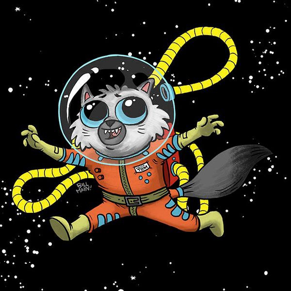
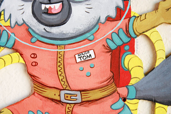
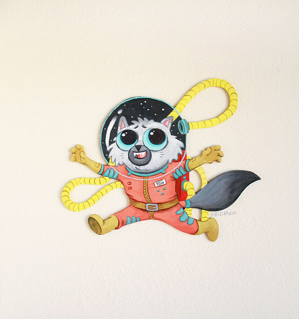
Major Tom, the Cat Happily Lost in Space
- Ground control to Major Tom...
He's taken his fish pills and he's put his helmet on. Boy does he look excited to be floating around in the vast unknown of space! Yet, he'd be even MORE excited to be drifting around on your walls at home. Tom would be right as rain if he were cruising on your nursery wall, kicking it in the kitchen or even bumbling around in your bathroom.Here's a small process of how Major Tom came to be. -
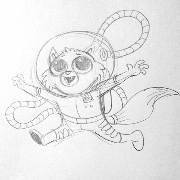 I always start with a small sketch in my trusty sketchbook!
 -
 Sometiimes, that sketch is refined into a digital mockup so I can test colors and whatnot...
 -
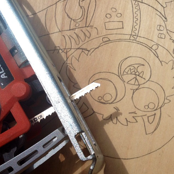 The drawing is then transferred to birch plywood and cut out carefully with a jigsaw.
 -
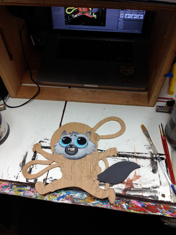 After being sanded and primed (in this case with clear primer), the paint begins. I guess I wanted to start with the cutest part first this time!
 -
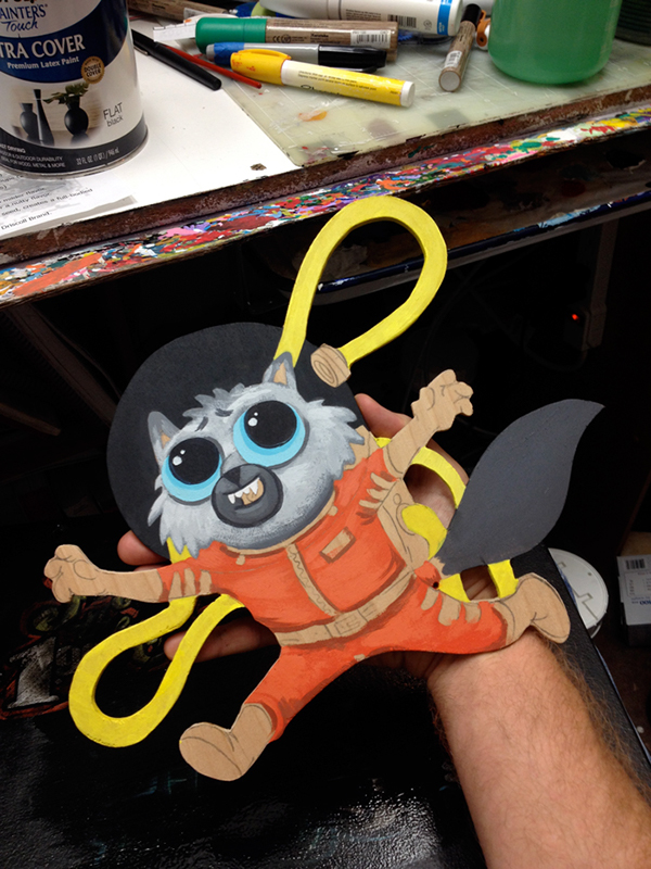 More refining and painting. Russian cosmonaut style!!!
 -
-
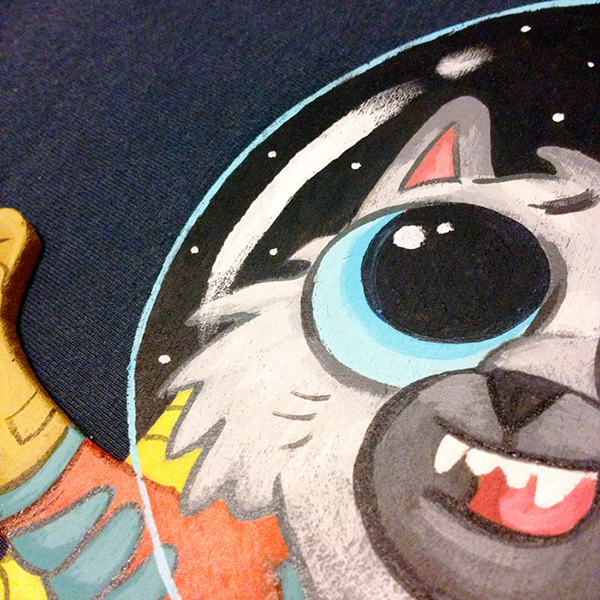
Pop them peepers!
-
 Buttons and gadgets because....buttons and gadgets.
 -
 What up gurl...?
Buy Major Tom here!
More wrestler character designs
Here's where we are so far:
 |
| Updated: Bruise E. Homemaker |
 |
| Updated: Lord Deville |
 |
| Updated: Nigel Quarkbottom |
 |
Grimly Mynock
5'5"
315 lbs.
From the Cave Planet Holio
|
 |
| "Supernova" Luto Graham 6'10" 310 lbs. From Hulkaterrania |